Thank goodness the World Cup is over. Viva Spain! It did eat into my productivity over the last number of weeks, but now its time to put it some serious time in the art hut.
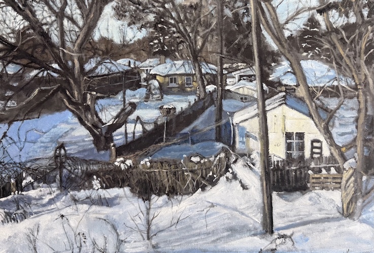
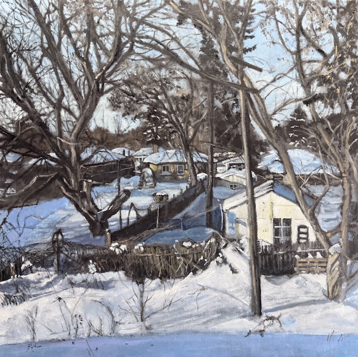
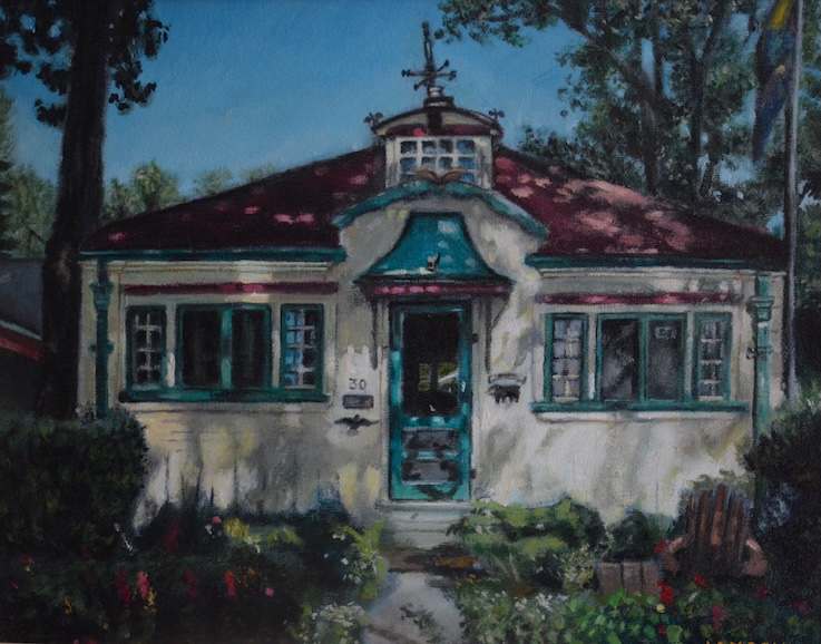
It’s not that I haven’t been productive – the work has continued through June and July. At this point I have six paintings well on the go, one that has been commanding my singular attention given a call for entry at the end of this month. I’m also working larger, as I knew would be inevitable.

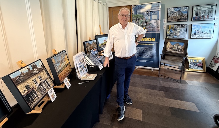
I’ve also been working on getting my profile out there, including a new feature at FineArtsNews — click here to read it. I’ve said it before but it requires repeating — the time in the studio represents only half the work of maintaining an art practice. At this point I am giving consideration to ways to further expand my audience, trying to overcome what I’m told is a common concern for artists — that I might be presenting myself a little too early. For those of us not willing to give into the level of consistency that requires you to paint versions of the same piece over and over again, it is an anxiety-driven question. I’m sure there are creative individuals on their death beds certain that the next phase of their work is where their breakthrough lies.
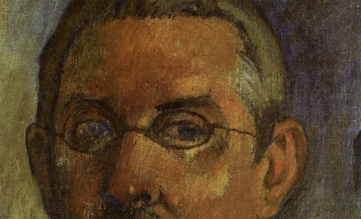
While I normally rotate between paintings, I have been working almost entirely on a single canvas for the last month in order to complete it for an upcoming call for entry on self-portraits. You may recall that last year I did three self-portrait studies as a means of working towards a more complete finished work. That more finished work is upon me now.
Self portraits can be tricky business. What was Rembrandt looking for that he painted himself fifty times? When we think of Vincent Van Gogh, Gustave Courbet or Frida Kahlo, the self portrait is a key part of their oeuvre. Even Canada’s own Emily Carr frequently represented herself in paint. Given art is about existance, this shouldn’t surprise anybody. I’d be willing to be most artists feel stripped bare from putting themselves out there in this way,
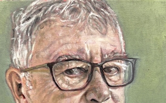
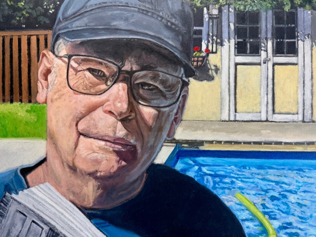
The detail at the top is the first sneak peak of this new portrait. It’s large (for me) — the painting will be 36″ x 36″ when complete.
As part of the preparation for this, I looked at a lot of portraiture. The ones that to me are the most successful are the ones that hint at a story, showing some vulnerability in the sitter. As artists we often capture our own insecurity, When I was a student at the University of Ottawa, I often crossed the Rideau Canal to look at Edwin Holgate’s Ludivine. Her direct gaze back at us speaks volumes about a young woman who has recently lost her mother and thrust into the role of head of family. There is something about it that it is heartbreaking, her hands clasped together before the portraitist.
What I was surprised to discover is how few portraits are rendered outside in nature. There are many where clearly the person posed for the painting indoors, then the artist applied the outdoors as a backdrop. When I look at Prudence Heward’s Rollande, for example, the sitter is obviously not in the outdoor setting that is depicted in the painting. The light sources are completely different.
Determine to go this route — inspired by the late David Hockney’s pool paintings — I quickly discovered that outdoor light can be difficult to work with. If the sun is out, it is likely your sitter will be squinting, even if they are standing in the shade. Our eyes often are critical to our identity, so it does present some difficulties around likeness.
The image above is still a work in progress. I’m not convinced yet that I have found my own light in this portrait. It feels a little stiff. I hope to fix that in the next week, along with a host of other problems currently besetting it. I did simplify the background, similar to Hockney, but I’m not sure I have given it the life it deserves yet. While I have painted water in many a landscape, doing so in a swimming pool is a new challenge, and I have been mixing aqua over and over to get it right. I have made some progress on this thanks to the magic of layering oil paint, but there is more to go on the pool itself. I am also trying to pull it back from being a distraction to the overall composition, finding a balance with the other elements.. At present, it is too energetic. Again, in tribute to Hockney, I do have someone swimming underwater in the pool, the reference for it taken from a family photo I snapped earlier in the summer. In the final image, I am looking up from a book about Hockney, perhaps a blunt instrument for those who might not otherwise get the references. The book has two portraits of Hockney at the bookends of his life, the back cover a photograph, the front a Hockney self-portrait. So my self portrait has become three portraits. Being able to convey a representation while at the same time trying to flatten the planes to make it look more like a book is a bit of a trick, one I haven’t quite got right yet.

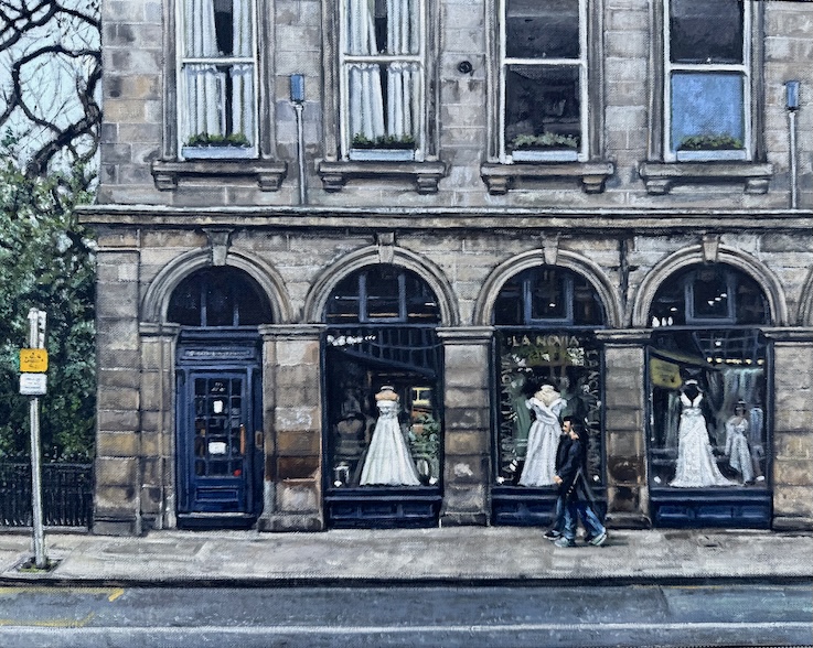
Next month we are travelling east where I hope to capture some fresh images to bring back to the studio. I’m hoping to convert some of those into a print series at a friendly price. I’m also having a second session with another individual around some portrait work I began in June. So far I have two oil sketches of her and I now feel ready to move on to the final stage. I do find that the sketches help develop a muscle memory around representing the face and help to resolve anticipated issues with the final piece.
So much going on. Stay tuned!